SoCal Tech Forum · Brand identity case study

A regional brand for a growing tech community, without losing the look its members already knew

When Rancho Cucamonga's tech meetup incorporated as a nonprofit and became SoCal Tech Forum, we redesigned its logo for the new name, built a full identity system around it, and delivered a 22-page brand guide its volunteer board uses to keep every meetup, post, and podcast on brand.

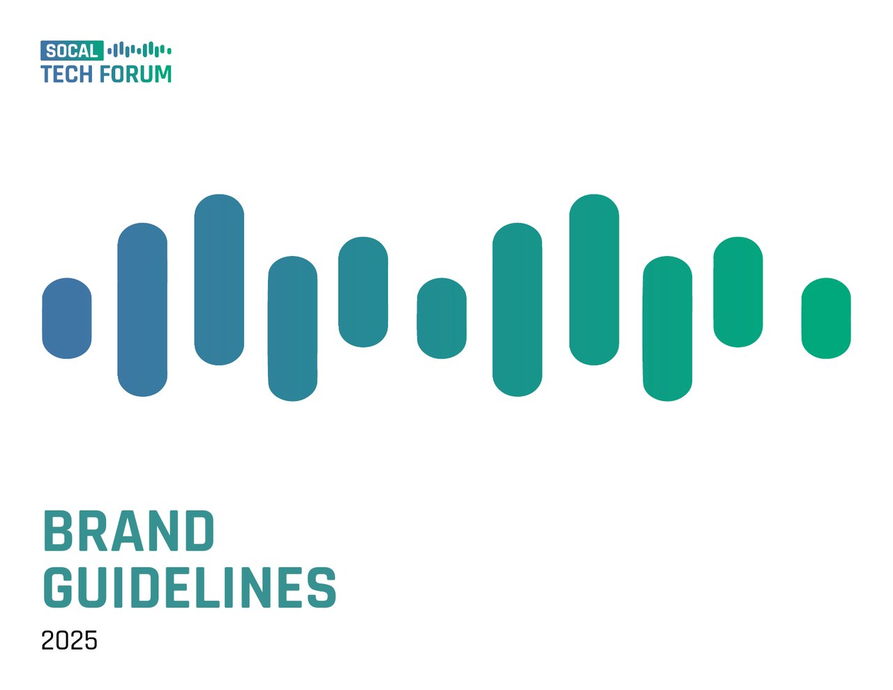
Cover of the SoCal Tech Forum Brand Guidelines 2025, with the logo's blue-to-green sound-wave bars above the title.

Key outcomes

< 6 weeks
from brief to a final logo, brand guide, and production files, in time for the forum's April 2025 meetup
22
pages of brand guidelines covering logo use, color, typography, imagery, and templates for events, blogs, and podcasts
7
logo formats, from a favicon-ready icon to sub-brands for the forum's gatherings and podcast

Project at a glance

Client
SoCal Tech Forum, a California 501(c)(3) nonprofit, formerly the Rancho Cucamonga Tech Forum. It hosts monthly meetups in Rancho Cucamonga where career technologists, hobbyists, and entrepreneurs meet for round tables, panels, and Q&A sessions, and it publishes a blog and the TechConnect podcast.
Audiences
Technologists, small business owners and startup founders, local government staff, educators and students, and professionals from across the Inland Empire, Los Angeles County, and Orange County
Services
Logo redesign, brand identity system, color and typography standards, imagery guidance, event and content sub-brands, brand guidelines, and production-ready file packages
Deliverables
Primary, secondary, icon, wordmark, monochrome, light and dark, and event-specific logos; a 22-page brand guide; and files in AI, SVG, PNG, transparent PNG, and JPG, with fonts included
Timeline
February 26 to April 5, 2025
Engagement
A donated engagement. Our founder serves on SoCal Tech Forum's board, so we knew the community and its goals firsthand.
The challenge

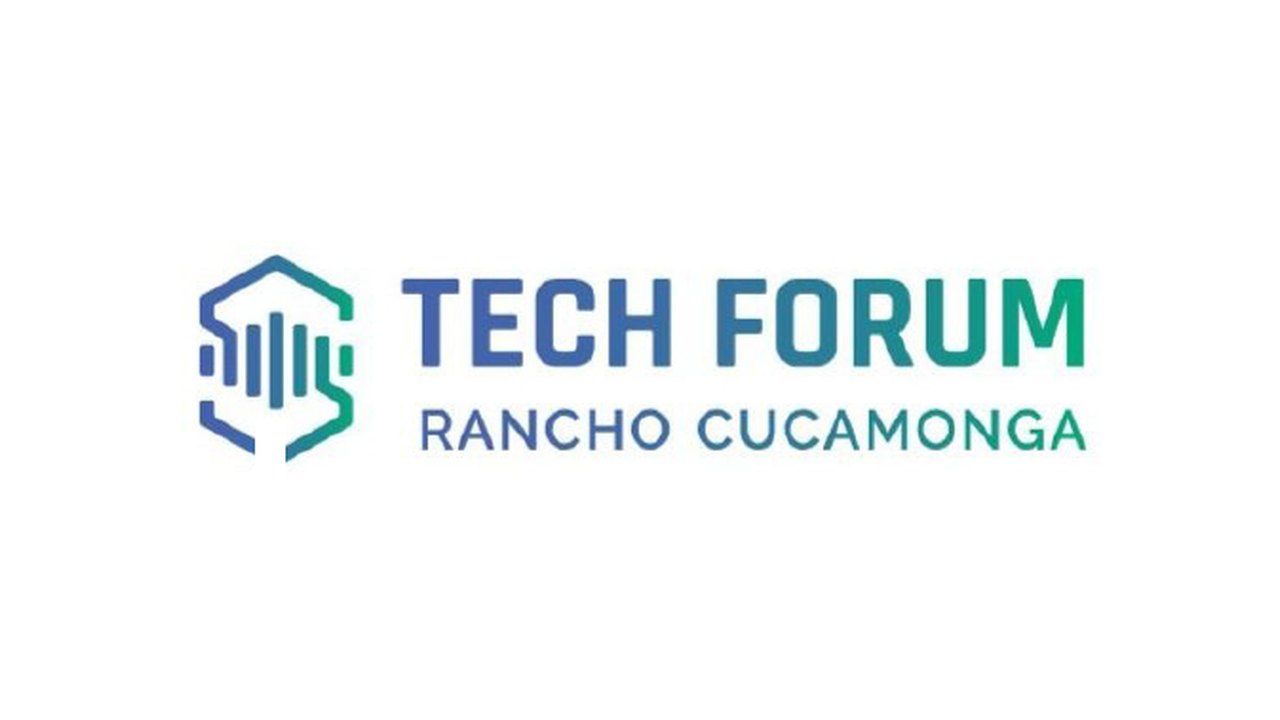
For years, the Rancho Cucamonga Tech Forum brought local technologists together each month under a recognizable mark: a hexagon framing a sound wave, with "Tech Forum" and "Rancho Cucamonga" set beside it in a blue-to-green gradient.

By early 2025, the forum had outgrown its city name. Members were driving in from Los Angeles and Orange counties, and the organization had incorporated as a 501(c)(3) nonprofit under a new name, SoCal Tech Forum. The new name needed a logo, and the logo had to work hard:

  • Keep what members recognized. The board wanted to keep the forum's existing look and feel, not start over.
  • Make a long name feel balanced. "SoCal" had to stand out without overpowering "Tech Forum," the part of the name the board wanted to emphasize, and the logo couldn't feel too long or too tall.
  • Work everywhere a volunteer team posts. The brand had to carry across Meetup, Eventbrite, LinkedIn, Discord, the podcast, slide decks, social graphics, and printed banners, applied by board members rather than a design staff.
  • Be ready on a deadline. The board planned to introduce the new brand at its April 2025 meetup.

Our approach

We worked through the forum's board, sharing options in rounds so each decision built on the last, and kept the brand guide in step with the logo so the system was ready the moment the logo was final.

  1. Phase 1

    Brief

    We started from the forum's existing logo files and the board's rebrand checklist, and agreed on the brief to change the name and keep the aesthetic.

    Key deliverables

    • A review of the existing logo and design files
    • Constraints for the new name and its emphasis
    • The list of channels the brand had to cover, from Meetup to printed banners
  2. Phase 2

    Explore

    We retraced the original logo with the new name, then explored layouts that balanced the name with the icon.

    Key deliverables

    • A retraced version of the original logo with the new name
    • Horizontal, two-row, and three-row layouts
    • Variations in type weight, size, and spacing, including a gradient "SoCal" badge
  3. Phase 3

    Refine

    We refined the board's favorite direction for balance and proportion, and tested it with people beyond the board before finalizing.

    Key deliverables

    • Rounds of revisions to emphasis, height, and width
    • A horizontal layout that opens the original icon into a free-standing sound wave
    • A final logo chosen by the board
  4. Phase 4

    Build the system

    We turned the logo into a complete identity, documented so the board could use it without a designer on hand.

    Key deliverables

    • Secondary, icon, wordmark, monochrome, light and dark, and event-specific logos
    • Color, typography, imagery, and illustration standards
    • A 22-page brand guide with examples for events, blogs, and podcasts
  5. Phase 5

    Package and hand over

    We delivered every file the board needed to update its channels and its slides for the April meetup.

    Key deliverables

    • Logo files in AI, SVG, PNG, transparent PNG, and JPG, with fonts
    • A standalone section preserving the original icon for future use
    • The brand guide as a PDF

What we delivered

A logo system for every format

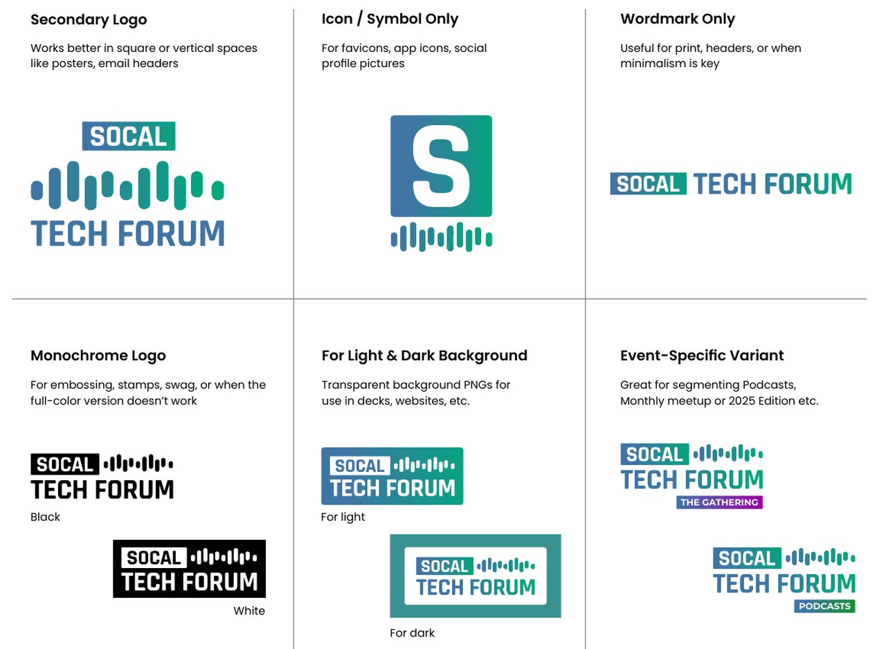
One logo can't fit every space, so we designed seven formats: a primary logo, a stacked secondary logo for square and vertical spaces, an icon for favicons and profile pictures, a wordmark, monochrome versions for embossing and swag, versions for light and dark backgrounds, and event-specific variants.

The variants give the forum's programs their own identity within the brand, such as "The Gathering" for events and "Podcasts" for its show.

Brand guide page showing six logo variations, including a stacked secondary logo, an "S" icon with sound-wave bars, a one-line wordmark, black and white versions, versions on colored frames, and event variants labeled "The Gathering" and "Podcasts."

Color and type that hold up on screen and in print

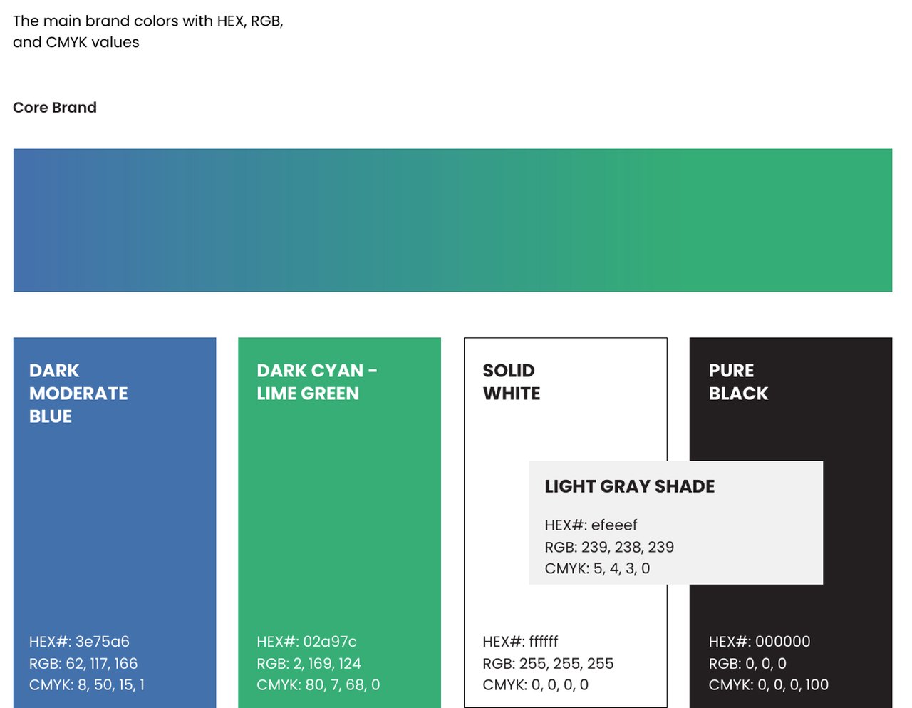
The palette pairs a dark moderate blue with a dark cyan-lime green, the gradient at the heart of the brand, plus white, black, and a light gray. Each color is documented in HEX, RGB, and CMYK, and four accent pairings give events and the podcast their own colors.

Type follows a clear hierarchy: Rajdhani Bold for the logo and headlines, Montserrat Bold for event sub-brands, and Poppins Regular for body text, with examples of what not to do.

Brand guide page showing the core gradient from blue to green above swatches for dark moderate blue, dark cyan-lime green, solid white, light gray, and pure black, each with HEX, RGB, and CMYK values.

Templates the board can reuse

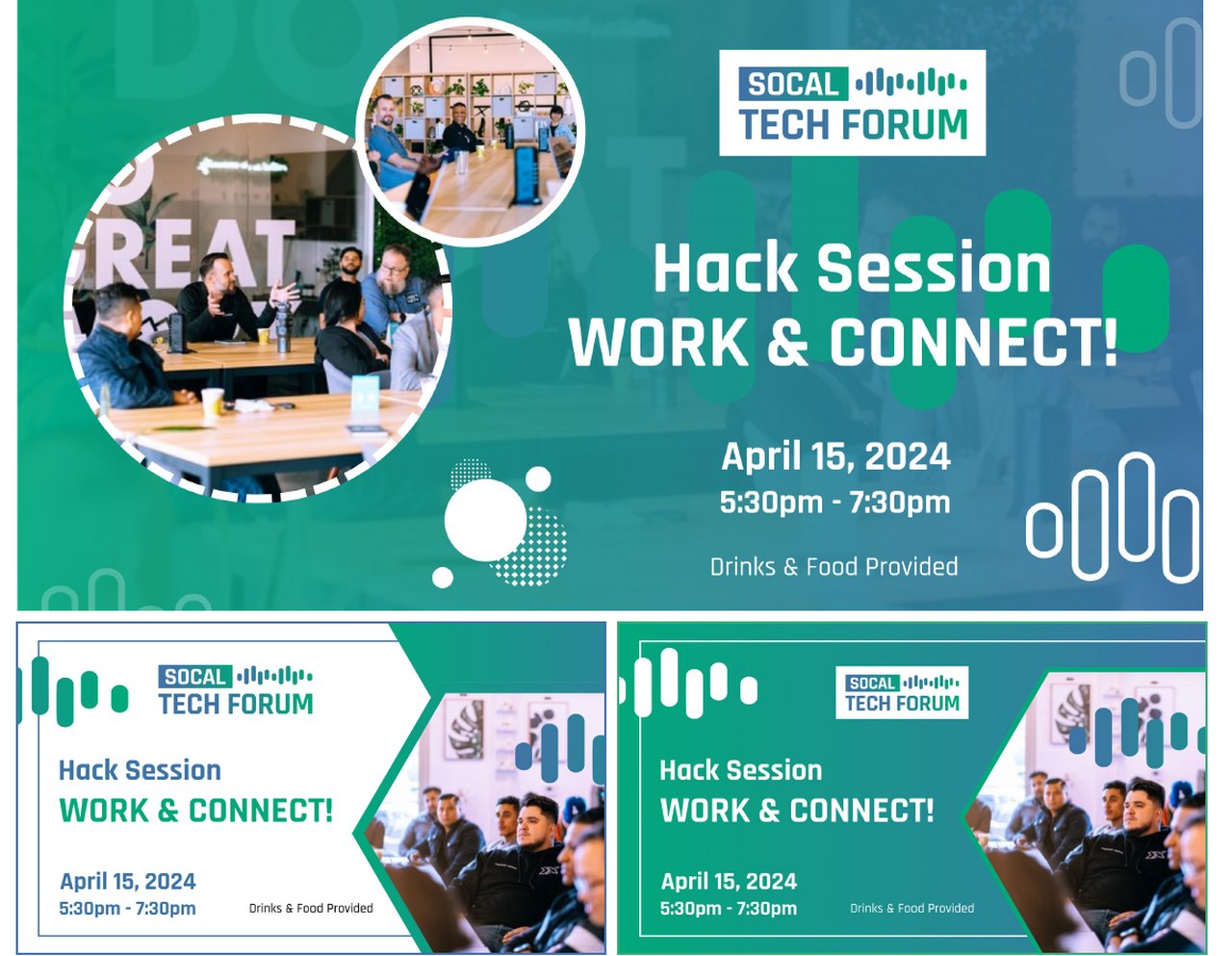
The guide shows the brand in use: event banners in three layouts, speaker graphics for the blog, and the podcast player. It also sets imagery rules (real people in real conversations, not posed stock photos) and turns the sound wave into an illustration and pattern that adds motion to any graphic.

Three sample event banners for a "Hack Session, Work and Connect!" meetup, using the new logo, the blue-to-green gradient, sound-wave graphics, and photos of members at a past forum.

A logo that evolves the original

We kept what members already recognized: the sound wave and the blue-to-green gradient. The hexagon opens up into a free-standing sound wave, "SoCal" sits in a solid gradient badge, and "Tech Forum" carries the most weight, as the board asked.

The result reads as the same community with a bigger reach.

Guidelines that protect the brand

Clear-space and minimum-size rules, along with examples of incorrect use, help anyone on the board place the logo correctly, whether on a slide, a banner, or a sponsor's co-branded materials.

Honoring the original icon

The board and longtime members were attached to the original hexagon icon. We redrew it with smoother, rounded edges and gave it its own section in the brand guide, so it stays part of the forum's story and is ready for future uses such as awards, a hackathon, or a podcast series.

Before and after

Before

The original logo, a gradient hexagon framing vertical sound-wave bars, with "TECH FORUM" and "RANCHO CUCAMONGA" set beside it.

After

The new SoCal Tech Forum logo, with a gradient "SOCAL" badge, a row of sound-wave bars, and "TECH FORUM" below.
The original Rancho Cucamonga logo (before) and the new SoCal Tech Forum logo (after)

Results

We delivered the final logo, the brand guide, and every production file on April 5, 2025, the day of the forum's April meetup, so the board could update its slides and materials before the event.

Since then, the board has used the guide to plan printed materials, including pull-up banners, table tents, name badges, and pieces co-branded with sponsors, and to choose one-color versions of the logo for items that can't print a gradient. The brand now represents SoCal Tech Forum in its monthly meetups, its blog and podcast, and partnerships such as TechCon SoCal 2026.

Goals, what we delivered, and the evidence
GoalWhat we deliveredEvidence
Keep the recognition the forum had builtA new logo that keeps the original sound wave and blue-to-green gradient, plus a preserved version of the original iconThe original icon is documented in the 2025 brand guide as part of the forum's history.
Emphasize "Tech Forum" while giving "SoCal" a clear placeA layout with "Tech Forum" at full weight and "SoCal" in a gradient badge, refined over several rounds with the boardChosen by the board as the final logo in April 2025.
Give the volunteer board a system for every channelSeven logo formats, color and type standards, imagery rules, and templates in a 22-page brand guideThe board has used it to plan banners, table tents, badges, and co-branded sponsor materials.
Be ready for the April 2025 meetupFinal files and the brand guide delivered in under six weeksBrief on February 26, 2025; final package on April 5, 2025.

Sources: project messages and design files, February 26 to April 5, 2025; SoCal Tech Forum Brand Guidelines 2025 (22 pages); SoCal Tech Forum board discussions, April and May 2025; TechCon Global press release, March 10, 2026.

An ongoing partnership

We've stayed close to SoCal Tech Forum since the rebrand. We've helped it apply for Google Ad Grants and continue to support its growth, and Digital Mountaineers is a proud sponsor of the forum.

Is this project like yours?

This case study is most relevant if your organization:

  • Is changing its name, merging, or expanding beyond its original city or region
  • Has incorporated or formalized and needs a brand that looks the part
  • Wants to refresh its look without losing the recognition it has built
  • Relies on volunteers or a small team to apply its brand across many channels
  • Runs events, a podcast, or other programs that need their own identity within one brand

Capabilities demonstrated

  • Logo design and redesign
  • Brand identity systems
  • Brand guidelines
  • Color and typography standards
  • Event and program sub-brands
  • Templates for events, blogs, and podcasts
  • Production-ready file packages

Planning a redesign or issuing an RFP?

We'd welcome the chance to bid. Tell us about your timeline and requirements, and we'll share relevant work, references, and an approach tailored to your organization.

← All our work